Dominating stage sets for two award-winning plays of the 21st-century are monochromatic paintings: a purely white canvas in Yasmina Reza’s Art and a red one in John Logan’s Red. They are the backdrop for witty and intellectual romps through our contemporary landscape that include questioning what is art. The debate, which crosses over into personal issues and relationships, keeps circling back to the paintings. At one point, Mark Rothko, the artist who is creating the work in Red, screams: “You have to make them look.”
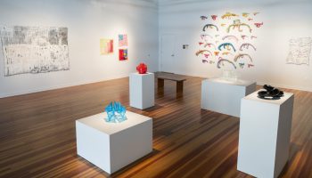
That need to make a viewer really see a work of art is the starting point of “Conversations in Red,” the exhibition currently at the Strohl Art Center. By choosing work that incorporates the color red, whether in a small detail or saturating the entire canvas, Judy Barie has focused our viewing. An abstract painter herself, she has a natural affinity for color-based work. This tight focus guides our perception as we examine each piece to see how the color red is used, but it also encourages broader reactions as various meanings attributed to the color affect our reading of the work. The ensuing conversation encourages a slow read, which is one of the most pleasurable ways of experiencing an exhibition.
Two artists stand out by emphasizing red but with differing results: Julian Jackson in oil paintings and Tom Marrinson with earthenware bowls. Jackson’s surfaces, carefully modulated shades of red relieved by accents of other colors, shimmer, obscuring any specific details or references, allowing our imaginations to take over. Do “Infrared I and II” present the view through the car window on a rainy day, facing the oncoming headlights with a fine mist blurring our vision? In red? Or is this a thin layer of blood with floating cells? Or a veil of consuming passion? Or, as the titles suggest, a map of body heat?
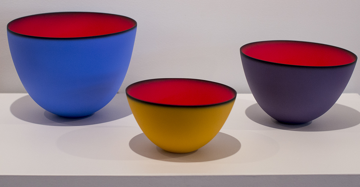
There is a similar intensity in the vessels made by Marrinson. The solid red of the interiors is heightened by the contrasting colors of the exteriors, separated by the black rim. At first glance, these bowls look like high-design objects found in high-end stores, but the density of the red actually creates a mirage. It is as if we are looking into a bottomless pit, a black hole into which everything disappears. That luminosity mirrors the ethereal and ephemeral surfaces of Jackson’s paintings, creating an intriguing conversation between works in two different mediums.
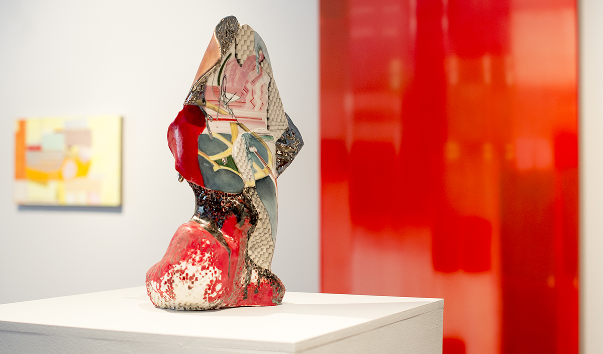
Other artists use the color red more as a compositional element. In his small, intimate paintings, Sydney Licht attempts to modernize the tradition of still life painting with references to our consumer culture. He uses red as an accent color in his images of stacked and patterned boxes. Leah Patgorski uses red as a compositional element in her unusual fabric paintings created with found textiles, including in one work a pillowcase. Grounded in architecture and geometry, her abstract compositions reference past styles such as Russian suprematism in “Wall.” Despite the rigor of her formal approach, Patgorski counterintuitively uses soft fabric, referencing fabric’s intimate relationship to human skin. By accessing other senses, she hopes to express something that cannot be put into words, making the ineffable concrete in works that connect to similar approaches in pieces by Jackson and Marrinson.
Linda Price-Sneddon, whose finely detailed drawings recall the work of Paul Klee, expresses this indescribable quality that she attempts to capture as the liminal, that in-between state that she describes as shifting from being awake to being lost in a dream. This provides a place where various senses can freely meet in the visual arena and close attention to details doesn’t lock us into a reality but, conversely, frees our imaginations. Perceptual awareness filtered through personal experience yields a rich variety of meanings in the liminal and in this exhibition.
It is fascinating that other exhibitions based on a particular color are on view now. One of the most interesting is “Blue Black” at the Pulitzer Arts Foundation in St. Louis. Artist Glenn Ligon, invited to conceive an exhibition based on the collection, was mesmerized by their monumental work by Ellsworth Kelly. This 26-foot high wall sculpture juxtaposes blue and black, creating a deep sense of the spiritual. Standing in front of it, Ligon had “aural hallucinations,” hearing the voice of Louis Armstrong singing “What did I do to be so black and blue?” These reactions became the basis of his cacophonous installation of 54 works by 42 artists.
Curated by an African-American artist in the city of Black Lives Matter, the show naturally references current racial tensions in disparate works, and the show is much more content and idea-driven than “Conversations in Red.” Seen in this context, Andy Warhol’s blue and black Liz Taylor speaks to ideals of beauty as filtered by race and the media, while Kerry James Marshall’s image of a black policeman in his uniform consisting of a blue shirt, tie, and pants and a black (bulletproof?) vest gains new nuances. Derek Jarman’s film connects blue, rather than black, with death, and Ligon speaks about the black and blue of bruises, both of which have only a loose connection with the look and meaning of the Kelly work. These various meanings, however, allow us to see the works in a new light, never masking the intentions of the artist but adding new dimensions and understandings.
Contextualizing, or perhaps more accurately recontextualizing the selected works, Ligon thought about the meaning of colors, while Barie was interested in how they were used. She quotes Alexander Calder, who said, “I love red so much, I almost want to paint everything red.” Calder’s work has a playful quality, an energy that can be associated with red, but that is just one of many possible references. Red is a color at the end of the spectrum, beside orange and opposite violet, but it also refers to a Communist or being in debt. It is the color of passion, love and lust, but a blush implies embarrassment. It signifies anger, fire and blood. There is ruby or cherry red, and one can see the range of hues in the lipsticks at any cosmetics counter. It is the color of power and strength found on exit and stop signs. It is used for both Cupid and Satan. In China, it signifies good luck, and Indian brides wear red, not white. In Russia, red means beautiful, so that Red Square is a beautiful square.
Artists can tap into any of these references or use red as a purely aesthetic element. The potential is without end, and Barie has offered a variety of possibilities in her open-ended dialogue. After being prodded to look for, at and beyond the color red in the selected works, our effort continues beyond the confines of the show. It even changes our perceptions of the Seth Clark show upstairs in the gallery. Now we notice that only a few of his barns are red, so we ask ourselves why. What makes them different from the white ones? Why did he make that choice? Is it an aesthetic or a content-driven decision? There are no absolute answers. Barie has skillfully given us the freedom to react individually to the tight-knit grouping of Clark’s work in his one-person show or the larger grouping of mainly abstract works in “Red.” The conversation Barie initiated carries beyond the confines of the show and even the gallery, giving us new ways to approach everything from art exhibitions to everyday objects.
Vicky A. Clark is an independent curator in Pittsburgh, a critic, and a professor whose speciality is the art of our times.