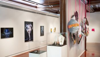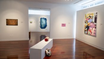
 A collection of oil on wood works by Mary Didoardo in the "ROY G BIV" exhibit in the Bellowe Family Galleries of the Strohl Art Center, Friday, June 22, 2018. BRIAN HAYES/STAFF PHOTOGRAPHER in the Bellowe Family Galleries in the second floor of the Stroll Art Center, Friday, June 22, 2018. BRIAN HAYES/STAFF PHOTOGRAPHER


Review by Howard Halle
Light, the medium that surrounds us and illuminates everything we see, holds a secret that is only revealed when it passes through a glass prism, or through airborne water droplets caught in the sun. The secret? That it isn’t the single color it appears to be. Instead, it splits into bands of red, orange, yellow, green, blue, indigo and violet, each representing a different wavelength of light. We call this phenomenon a rainbow, or more scientifically, the spectrum, but it is also known by the acronym, ROY G BIV, a term that also provides the title for this tightly focused exhibition at the Strohl Art Center.
Featuring just three artists — Mary Didoardo, Ted Larsen and Deborah Sigel — “ROY G BIV” is a small show framed by a big topic, one that goes beyond color per se (though it is the main issue for these artists) to engage the question of how we see. Since time immemorial, the rainbow has offered proof that the way we observe the world is something of an illusion, an evolutionary adaptation that limits our eyes to one wavelength of light out of many. It helped us to make sense of reality, but at the same time, obscured a truth that wasn’t uncovered until the 17th century, when Sir Isaac Newton’s experiments unveiled the spectrum hiding in plain sight.
In the 20th century, knowledge of the spectrum helped painters to mix colors and use them compositionally. It also figured as a subject in and of itself for artists from Piet Mondrian to Ellsworth Kelly, whose historical example grounds the contributions to “ROY G BIV.”
All of the pieces here are abstract to one degree or another, swinging between the organic and the geometric in a manner that speaks, perhaps, to the fact that while the spectrum comes from nature, its orderly divisions suggest something artificial. Besides color, texture is an important component for the artists, as each distresses the surfaces of his or her work to varying intensity — disturbing, as it were, the equilibrium of color. This also has the effect, intentionally or not, of adding a certain existential edginess to the proceedings.
Take, for example, the work of Mary Didoardo, a New York artist whose studio is located in the industrial environs of Long Island City, Queens. The sole painter in the group, Didoardo offers five oil-on-wood panels that combine painterly backdrops (with greens and purples as go-to colors) and lines that exuberantly loop across the picture plane. A synthesis of calligraphy and scrawl, these animated arabesques evoke the idle doodles made during an insufferably long meeting or the lazy track of a fly buzzing a picnic. But just as pertinently, they represent a kind of erasure, as does the artist’s method of building up and sanding down innumerable coats of pigment to reveal colors peeking out from one another. Elsewhere, she resorts to chipping the paint off to expose ragged vestiges of previously applied layers, much as you’d find on the walls of a crumbling building. While it may seem strange to say so, there seems to be an undercurrent of trauma to Didoardo’s otherwise cheerful celebration of hue.
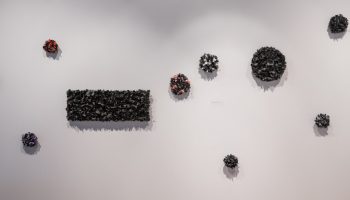
A similarly conflicted relationship between surface texture and color informs the metal wall reliefs of Ted Larsen, an artist who lives and works in Santa Fe, New Mexico. Larsen uses at pieces of steel salvaged from manufactured goods — cars, perhaps, or appliances. Each remnant retains a factory paint job patinated by rust, scratches and bleaching by the sun, giving Larsen’s palette a faded, forlorn quality. The metal is snipped into various configurations before assembly with screws or rivets into sculptures that stylistically blend Minimalism and Constructivism. A couple of them divide into blocks of color that immediately recall Mondrian; another explodes into a cubistic tangle of strips casting an intricate shadow on the wall. With their modest scale and roughened appearance, Larsen’s objects strike a careful balance between toughness and delicacy, while also suggesting that they have seen better days.
While Larsen uses found color, and Didoardo uses color from a tube, Deborah Sigel, a professor of ceramics at Millersville University in Millersville, Pennsylvania, essentially sculpts in color, thanks to her medium of choice: Egyptian Paste, a moldable mixture of clay, sand, soluble salts, granulated glass and pigmenting agents that can be left to dry or red at low temperatures into different colors without glaze. Here, the paste, rendered in various pastel shades, has been stuffed between the ribs of open frame armatures welded into stylized flower forms with steel rods dipped in black. The result resembles a boldly outlined cartoon image, though the paste itself, matte and sparkling with iridescent flecks, is riven with large cracks like the mud in a dried riverbed. These crevices also conjure a sort of lost grandeur in miniature, true to the memory of the civilization from which Sigel’s material takes its name.
So, is a show like “ROY G BIV” just about color? On balance, yes, though I’d submit that every work of art, however abstract, ultimately reflects the tenor of its time, and so it may be with something as formal as taking inspiration from the color spectrum. Back in the 20th century, the likes of Mondrian and Kelly still shared a belief in progress, a commitment to Enlightenment values and a faith in the scientific method pioneered by Newton. Today, those certainties are under assault by know-nothingism and illiberal attitudes. Survivalists stock up on freeze-dried food, while some members of the .001 percent have reportedly reached out to Silicon Valley for technological advantages that will ensure their survival during the apocalypse. Is it unreasonable to wonder, then, if artists today see color, or anything else for that matter, in a somewhat darkened light?
Howard Halle is editor-at-large and chief art critic for Time Out New York.